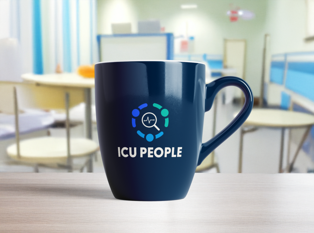
PROJECT
Logo Design for ICU People
Client:
ICU People
Year:
2024
Role:
Brand Designer
CONTEXT
ICU People is a specialized research unit dedicated to analyzing and improving the experiences of patients, families, and healthcare providers in intensive care units. The project called for creating a sophisticated visual identity that would effectively represent their three main research domains while maintaining a cohesive and professional appearance.
CLIENT CHALLENGES
The research unit needed a brand identity that would:
- Balance analytical rigor with human empathy
- Strengthen their reputation in the medical research field
- Facilitate clear communication of research findings
- Create distinct yet connected visual representations for their three research areas
RESEARCH AND DISCOVERY
The Unit Research key research domains:
Critical Care Patients
Focus on hematology, examining the unique challenges faced by these critical patients.
Patient’s families
Exploring exploring post-ICU life impacts: the emotional and practical impact on loved ones.
Health Professionals
Analysis of burnout and working conditions to improve staff well-being and conditions.
These interconnected areas required careful consideration to ensure proper representation while maintaining unity in the overall brand identity.
DESIGN STRATEGY
My recommendation were to:
Create a primary logo for corporate communications.
With sans-serif typography for a modern feel, along with colors that convey trust, empathy, and medical professionalism.
Developing sub-logos for each research domain.
Incorporating distinctive icons or names to help families connect with the organization during challenging and confusing times.
DESIGN CONCEPTS
Two distinct concepts were developed, each approaching the challenge from a different perspective.
Concept 1: The Human Heart
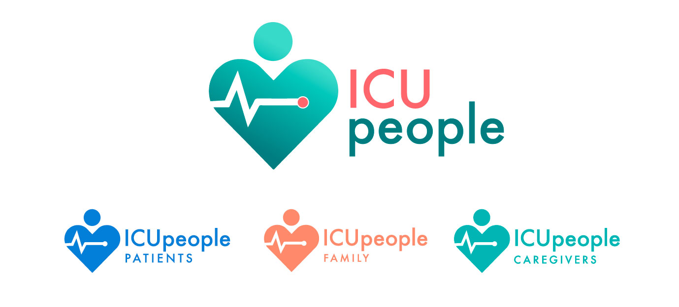
Primary Logo structure
- Balance of medical symbolism and human care
- Heart shape integrating a human figure
- EKG line incorporation, directly referencing ICU monitoring
- Gradient application creating depth and modernity
Color Strategy
Primary logo:
- Teal: Consistency for healthcare provider materials
- Teal gradient: Primary mark expressing professionalism and care
- Coral pink/Soft orange: Warmth for family-focused applications
- Blue: Trust and reliability for patient services
Sub-logos: Consistent heart-based design with color coding
- Caregivers: Teal, representing professional healthcare
- Patients: Blue, emphasizing medical care
- Family: Soft Orange, conveying warmth and support
Typography Strategy
In both concepts I used sans-serif typography, chosen for modernity apparence, good readability.
In the Human Heart version I focused on:
- Mixed weight approach with playful case treatment
- Softer, more approachable character forms
- Variable sizing creating visual hierarchy
Concept 2: Human-Centric Circle
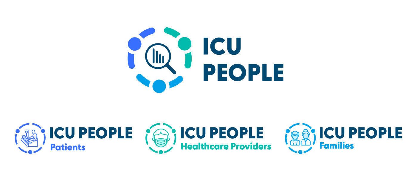
Primary Logo structure
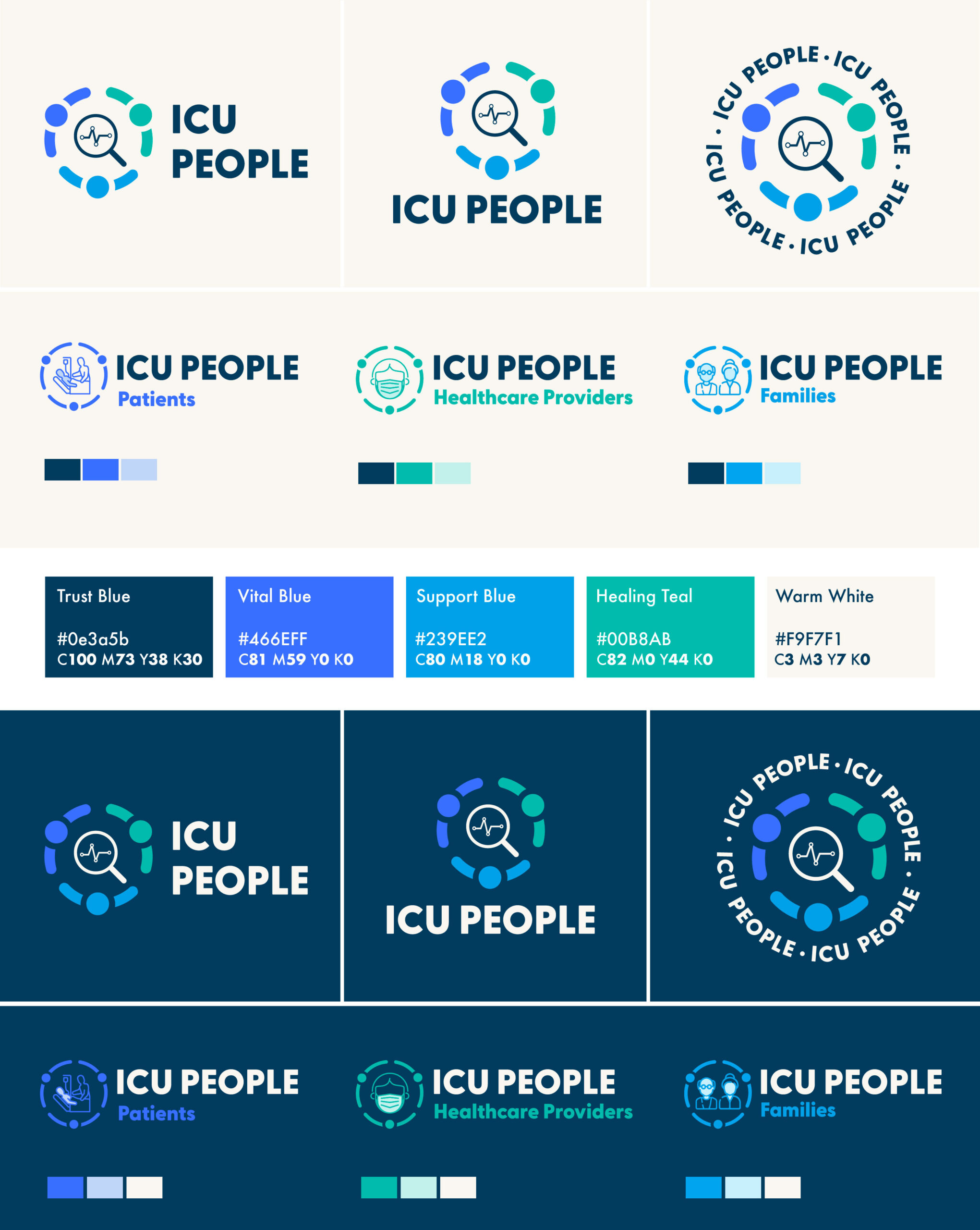
- Circular design incorporating three abstract human figures viewed from above.
- Central magnifying glass with data bars, emphasizing the research of the unit.
- Segmented circle creating unity while allowing for distinct elements.
- Modern, geometric approach with clean lines and shapes.
Color Strategy
- Royal blue: Representing patient care and medical reliability
- Teal: Symbolizing healthcare providers and wellness
- Light blue: Expressing family support and comfort
Sub-logos
Each sub-logo maintains the circular framework while featuring distinct icons:
- Families: Two-person silhouette representing family bonds
- Patients: Laboratory/medical equipment icons
- Healthcare Providers: Medical mask symbol
Typography Strategy
In both concepts I used sans-serif typography, chosen for modernity apparence, good readability.
- Bold, geometric type with strong presence
- Uppercase treatment emphasizing authority and clarity
- Consistent weight across all applications
CHOICES
To help my client to choose the best option according to what they wanted to emphasize. I did sum up the focus of each logo.
Human Heart Strengths
- Immediate emotional connection
- Direct medical reference
- Simpler, more iconic approach
- Strong scalability
- Clear connection to ICU environment
Research Circle Strengths
- Strong emphasis on research methodology
- Clear visual separation of elements while maintaining unity
- Modern, technical appearance
- Highly systematic and scalable
- Direct representation of the three research domains
CLIENT FEEDBACK
“The first version seemed too ‘cardiology’ which concern only the heart and vascular system. ICU is a General critical care across multiple organ systems.”
The client liked the second version emphasizing on the research; the unity and the 3 icons that are more evocative and easy to identify. But they requested to incorporate the heart monitor as they liked it from the first version.
ITERATIONS
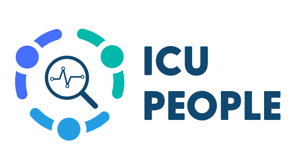
I replaced the graph inside the magnifying glass by the monitor lines that also have a double connotation : “Data” + “heart monitor”.
IMPLEMENTATION
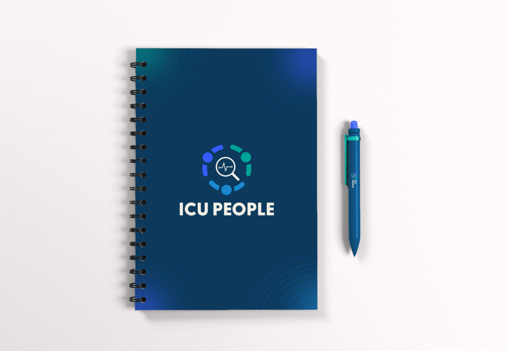
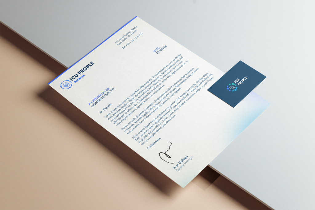
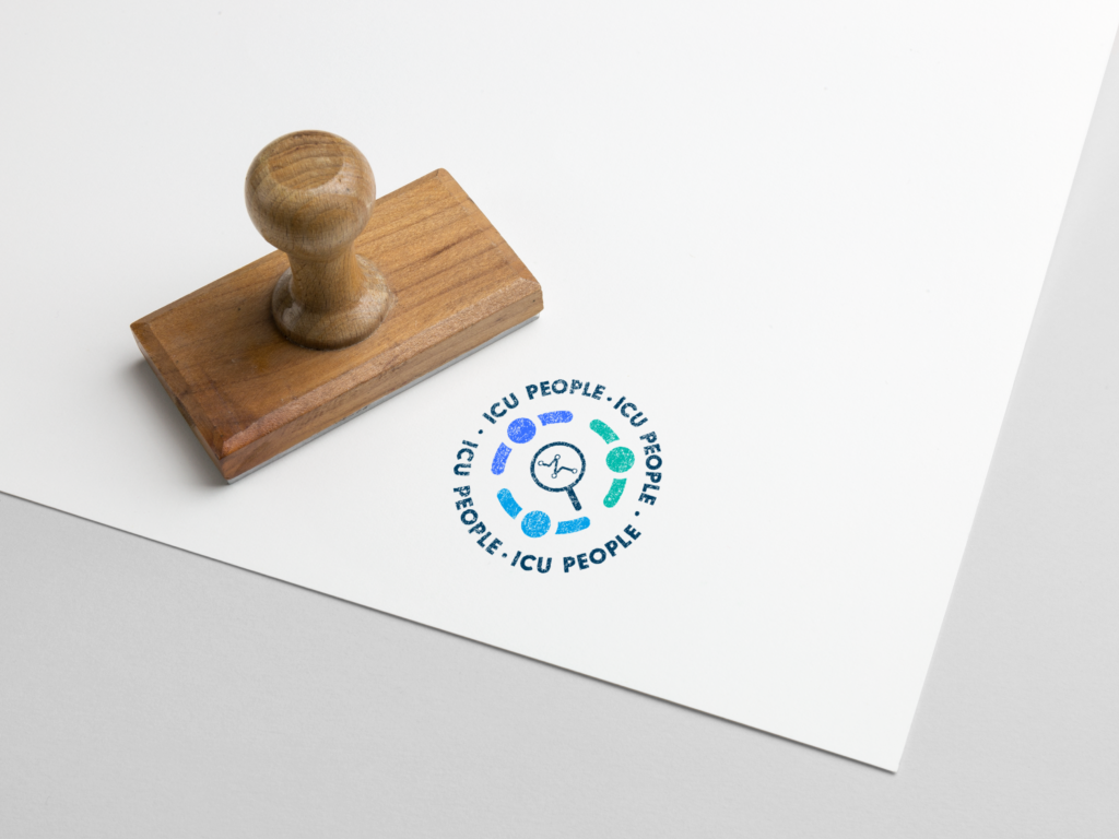
I then adapted all the versions for my client to visualize how the logo would live on different creatives so He could project himself.
