WALKME · SALES KICKOFF EVENT · TULUM, MEXICO
COMPANY
WalkMe
YEAR
2026
ROLE
Creative lead
TIMEFRAME
3 weeks
THE CONTEXT
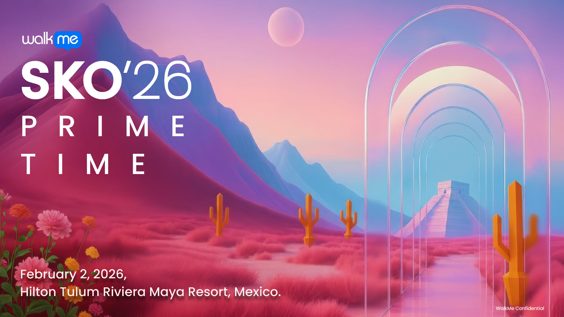
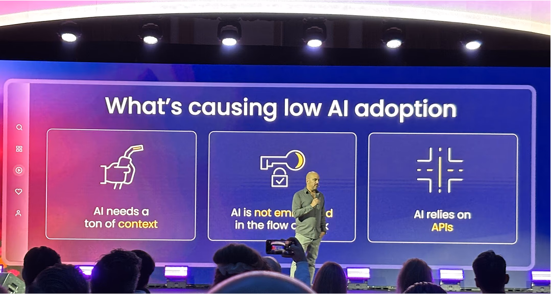
SKO 2026 marked the launch of WalkMe’s AI era. As “Prime Time” for the firm, the tech, and market validation converged. All pieces were in place to lead this shift. The visual identity had to embody this specific moment of high execution and global leadership.
THE CHALLENGE
Given an open brief, I defined “Prime Time” by building a creative direction from scratch. I translated the company’s AI pivot into a concrete visual strategy, illustrating WalkMe’s transition into an AI-driven future.
400+
global attendees
10+
countries represented
4-day
immersive experience
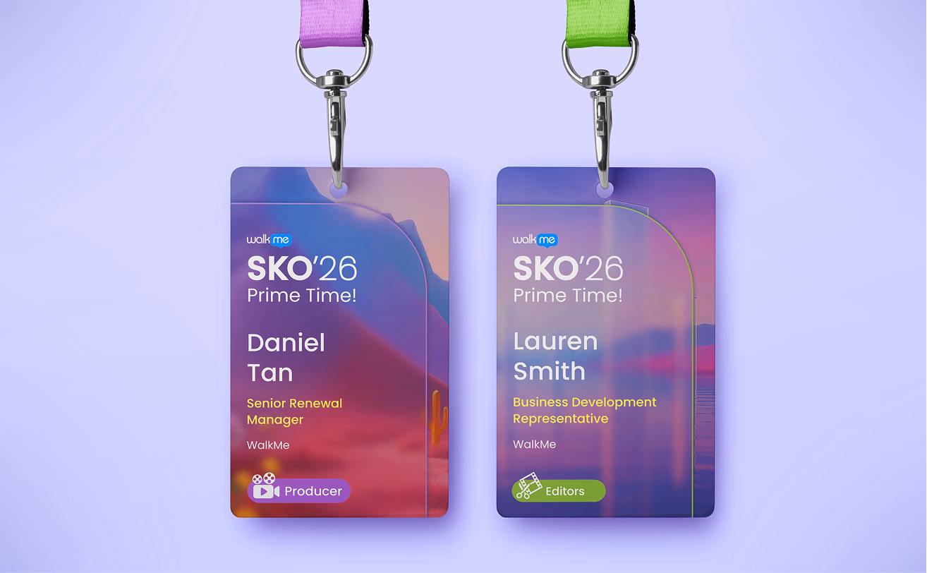
Onsite Experience
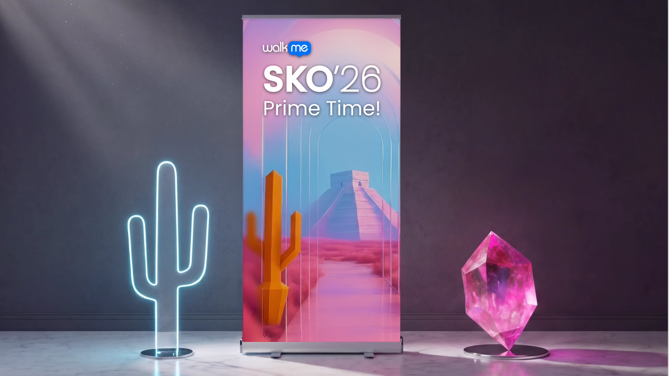

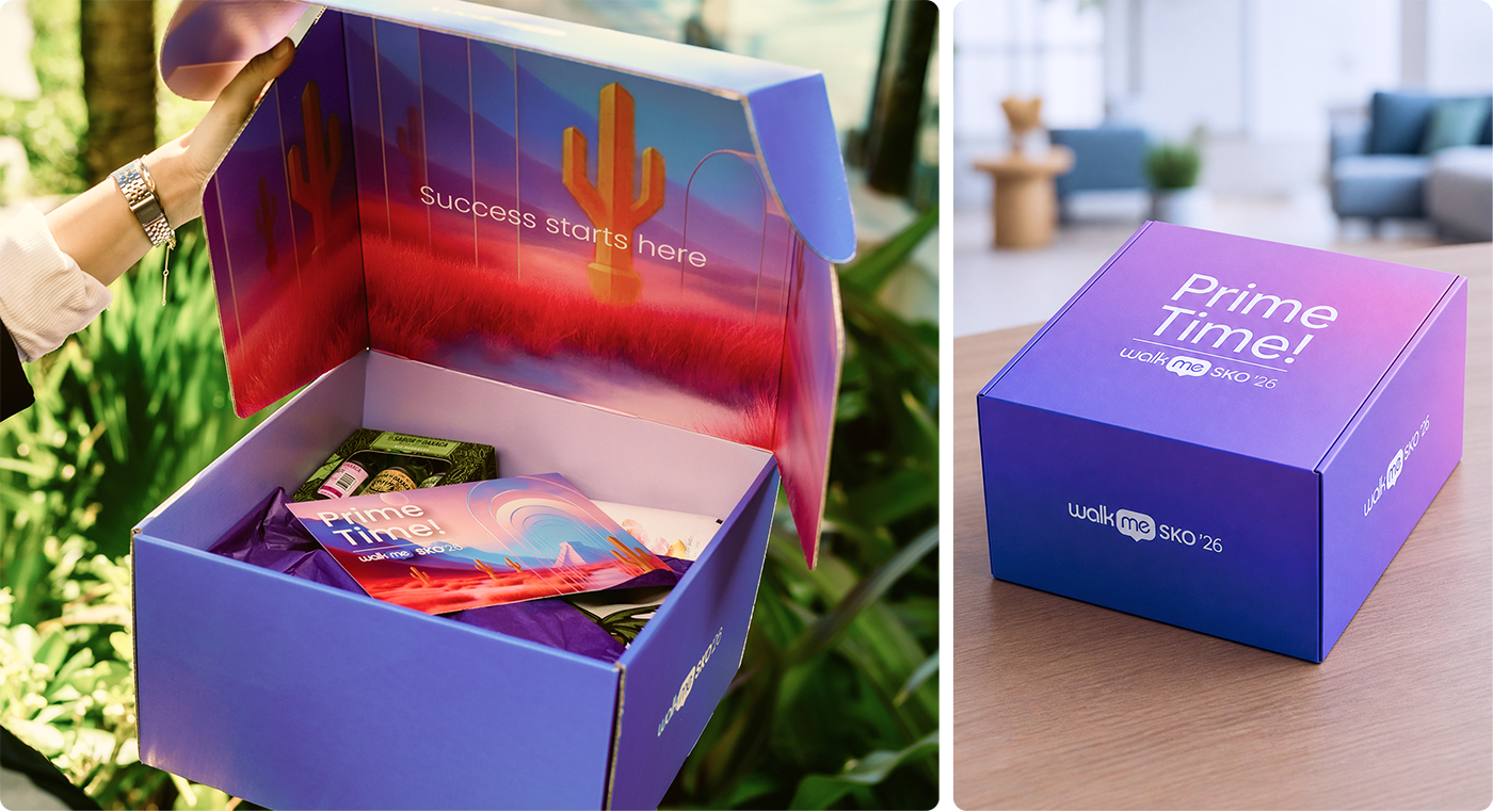
Welcome Kit Overview
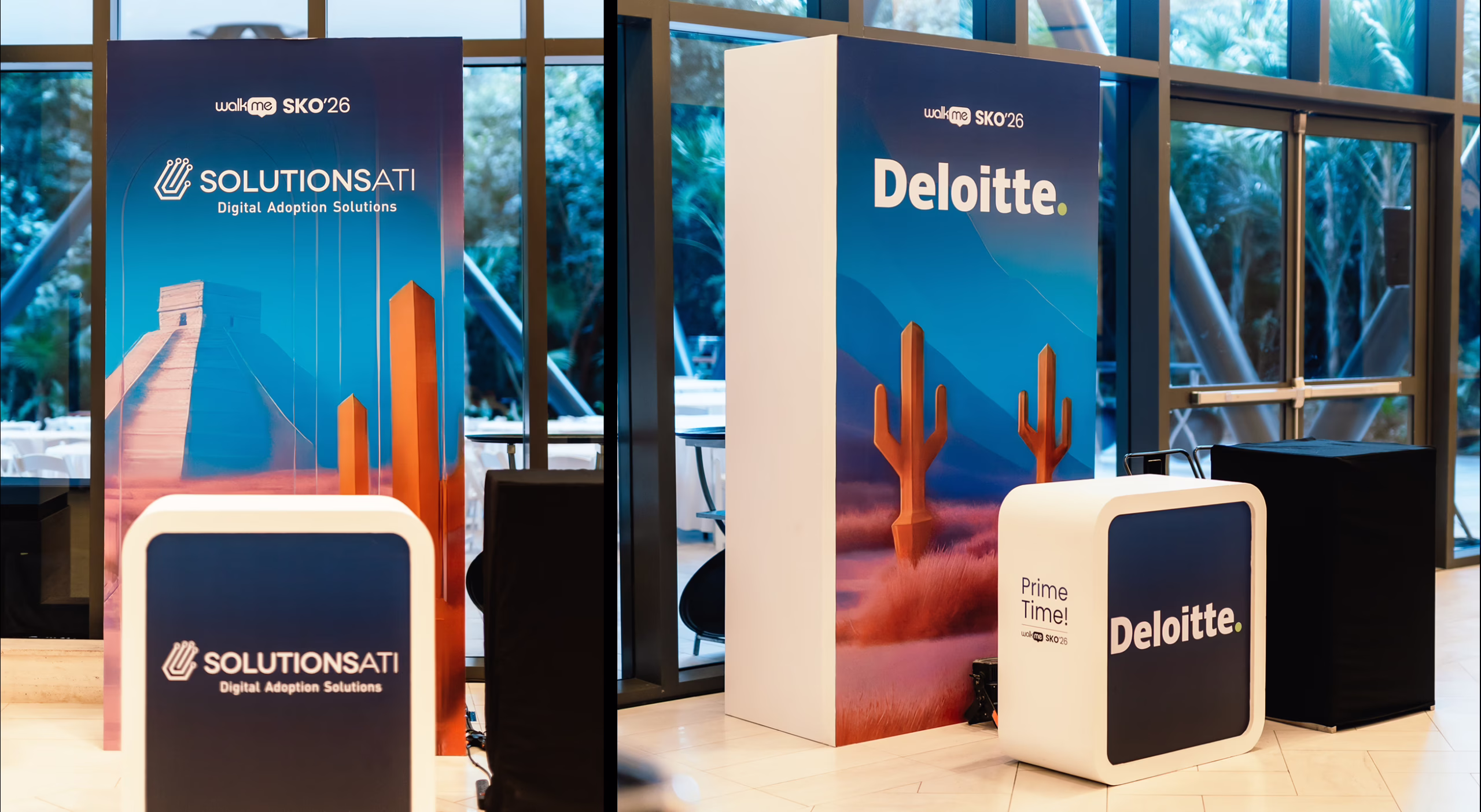
Pre-event Promotional Assets Overview
DESIGN PROCESS
How did I get there?
Concept explorations
AI Display
A surreal composition featuring futuristic glass elements and AI-driven visuals on display.
→ Strong local identity, but insufficient connection to AI and the company’s evolution.
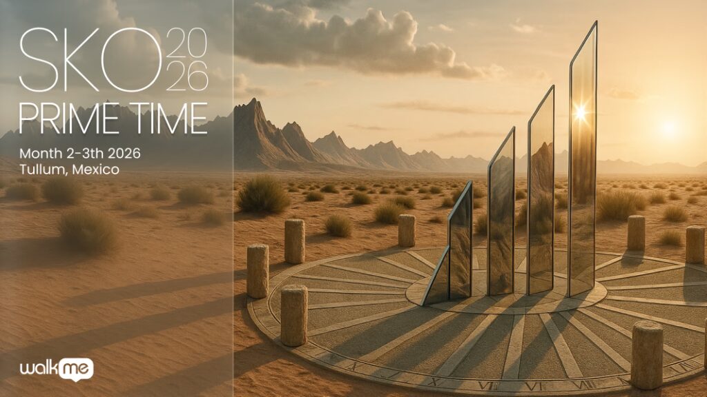
Time-based symbolism
Prime Time interpreted as the moment where time reaches its peak with a modern sundial.
→ Conceptually relevant, but too abstract and disconnected from the AI narrative.
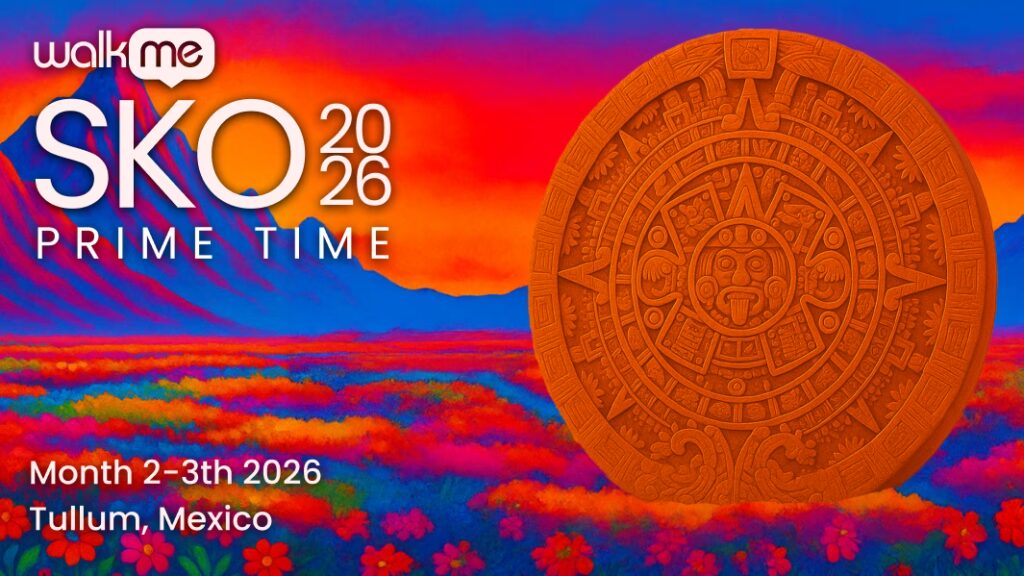
Maya and Mexican symbolism
A more expressive and colorful approach inspired by Mexican culture and references such as Frida Kahlo.
→ Strong local identity, but insufficient connection to AI and the company’s evolution.
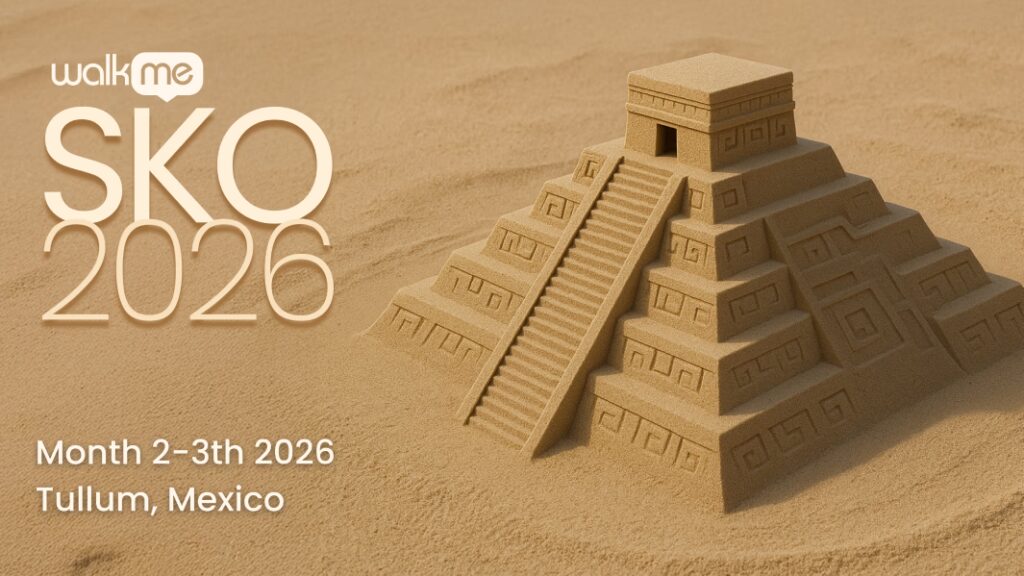
Maya symbolism
A natural, location-driven approach inspired by Tulum’s monuments and environment.
→ This direction reflected the location, but lacked a broader narrative.
Refinement
We aligned as a team on a clearer definition of “Prime Time”. We refined the direction to balance three key elements: a surreal AI-driven environment, subtle references to Tulum, and a modern, scalable visual language.
Invitation to Surreal world
Introduced the idea of entering a new space: an AI-driven world.
→ The narrative was right, but the execution lacked the location look and feel.
A Gateway to the Future AI World
I then integrated architectural references and local elements.
→ The direction was well received, with feedback to further strengthen the cultural context.
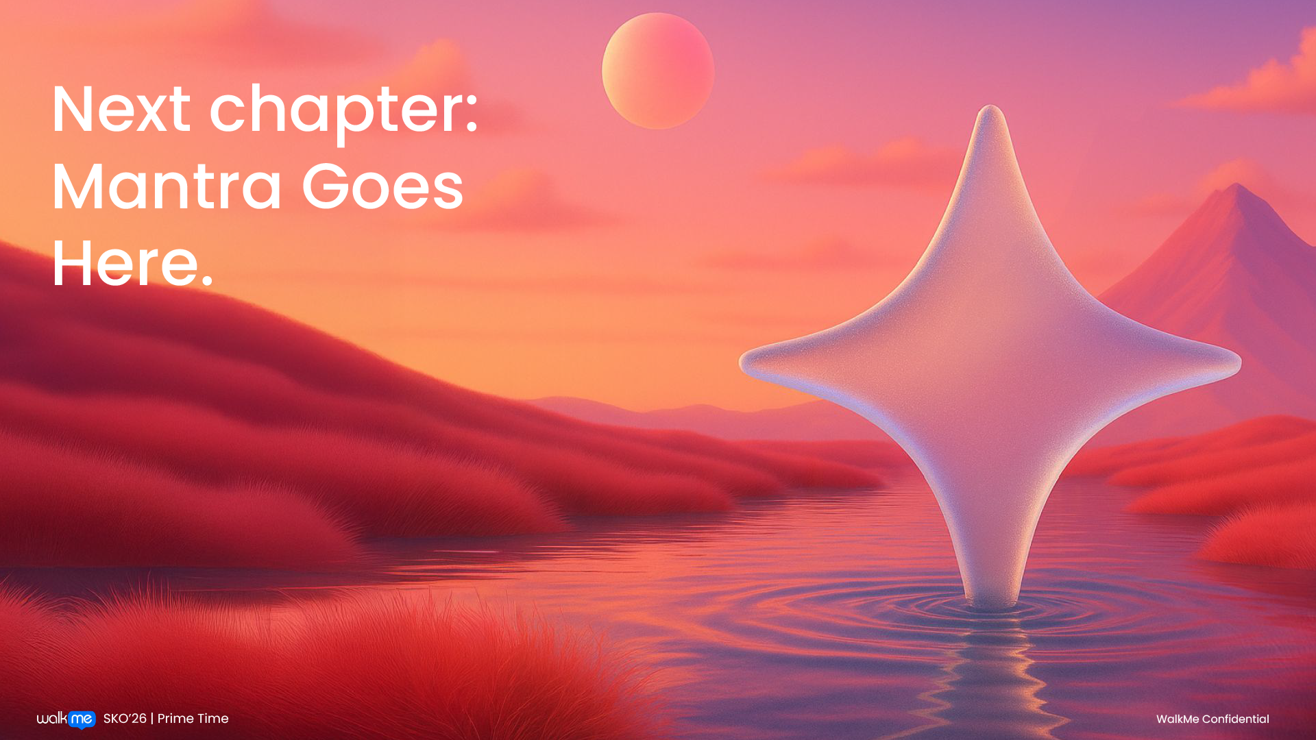
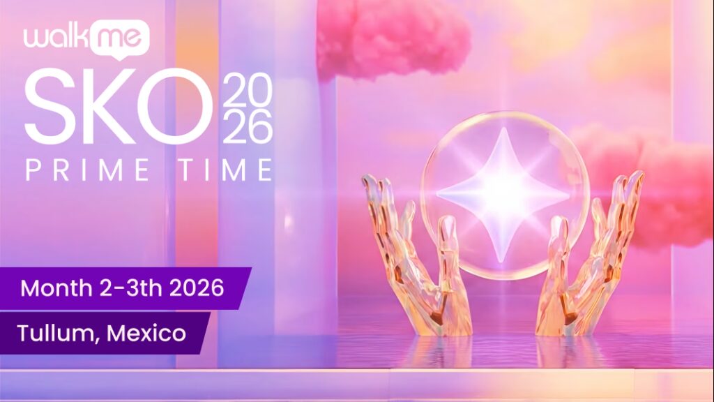
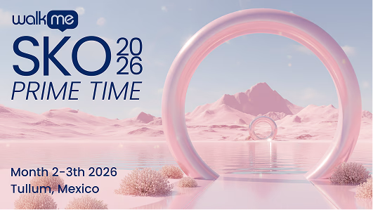
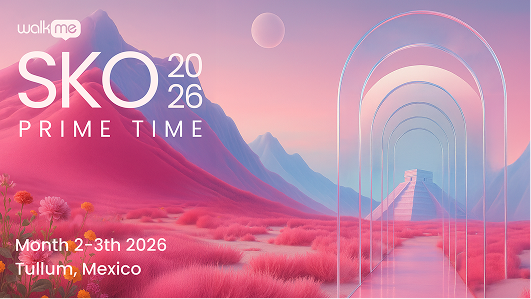
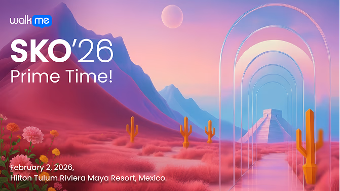
Refined Main Image
A visual gateway into a new era, rooted in Tulum’s landscape.
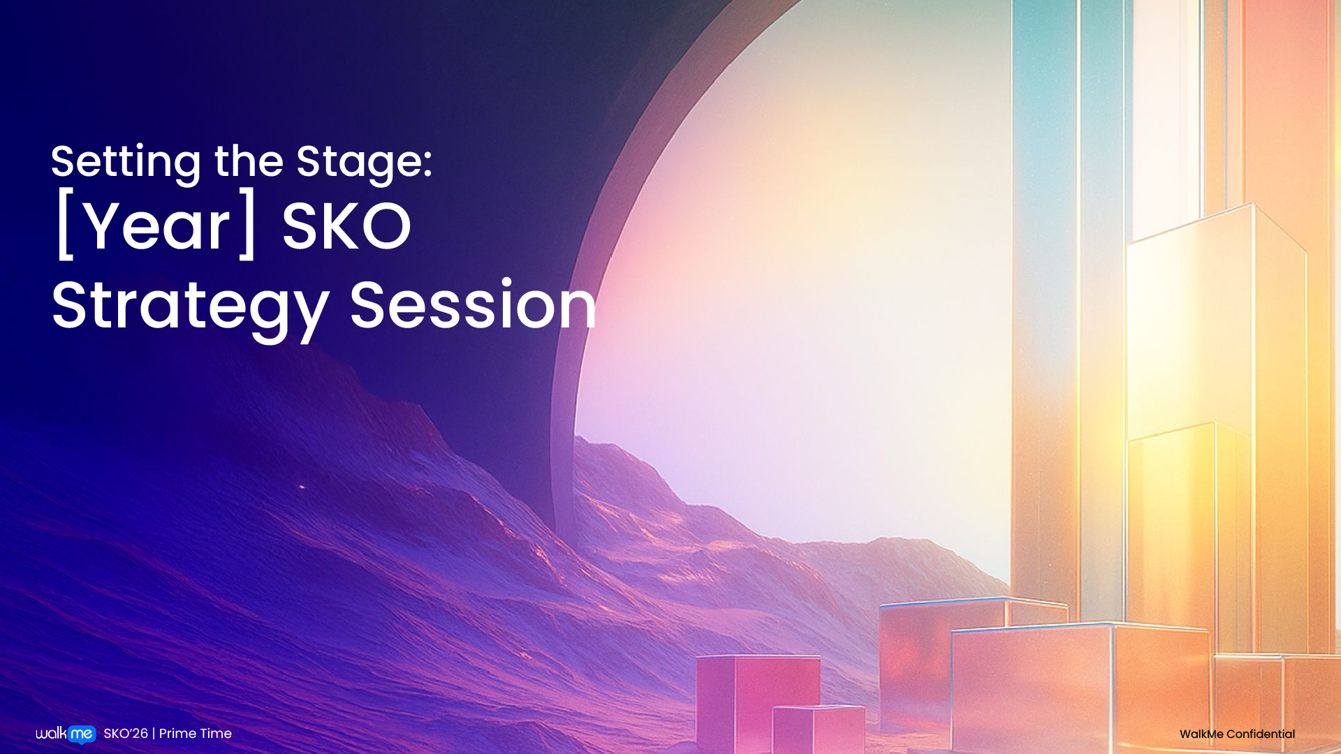
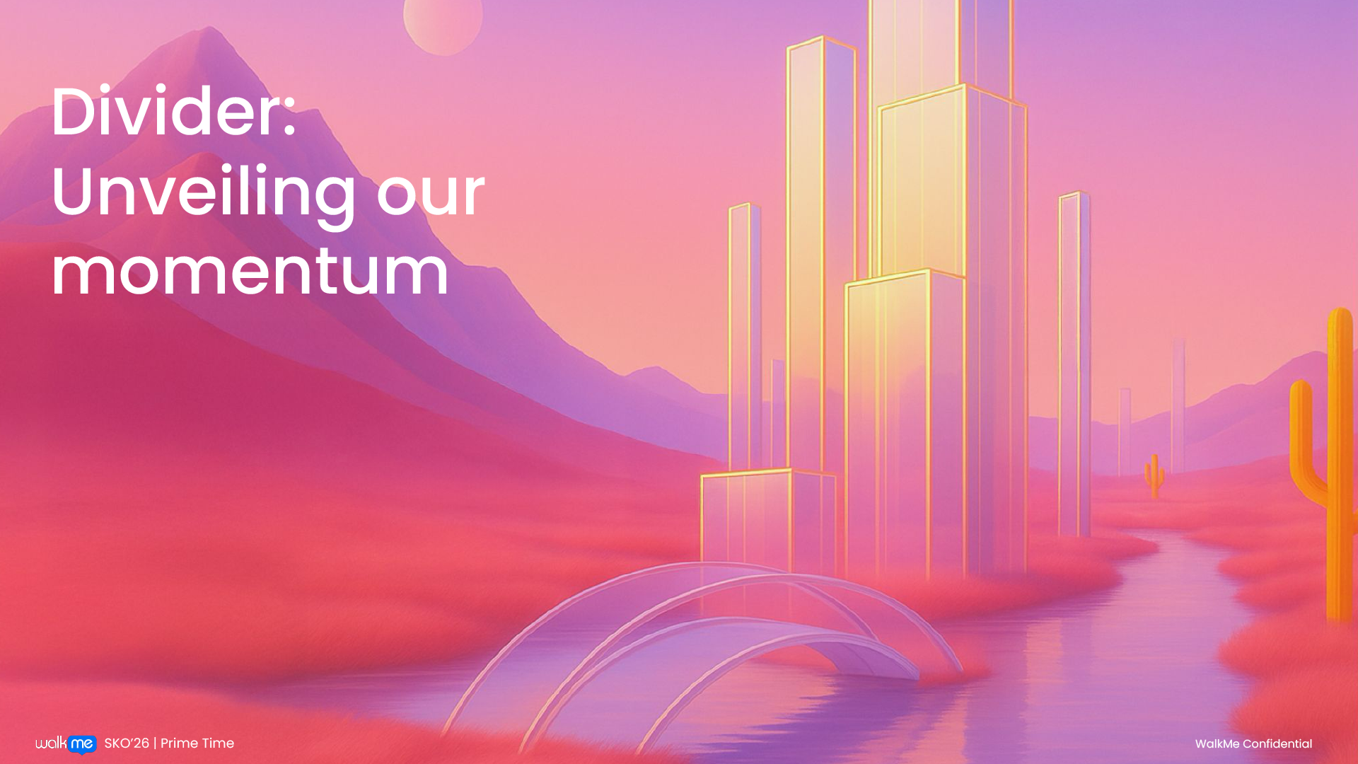
The system combines surreal gradients with a recurring arch motif, symbolizing transition and progression into an AI-driven future.
- Aligns with the AI-driven business narrative
- Moves beyond expected event aesthetics
- Scales across multiple formats
- Creates a cohesive and immersive experience
OUTCOME
Project Success

Executive Buy-In
Selected by the CEO from three competing creative directions proposed by three designers, and chosen as the visual language for WalkMe’s most strategically significant SKO to date.

From Concept to System
Once approved, the direction was refined into a scalable visual system, then handed off to the internal design team and an external production partner for deployment.

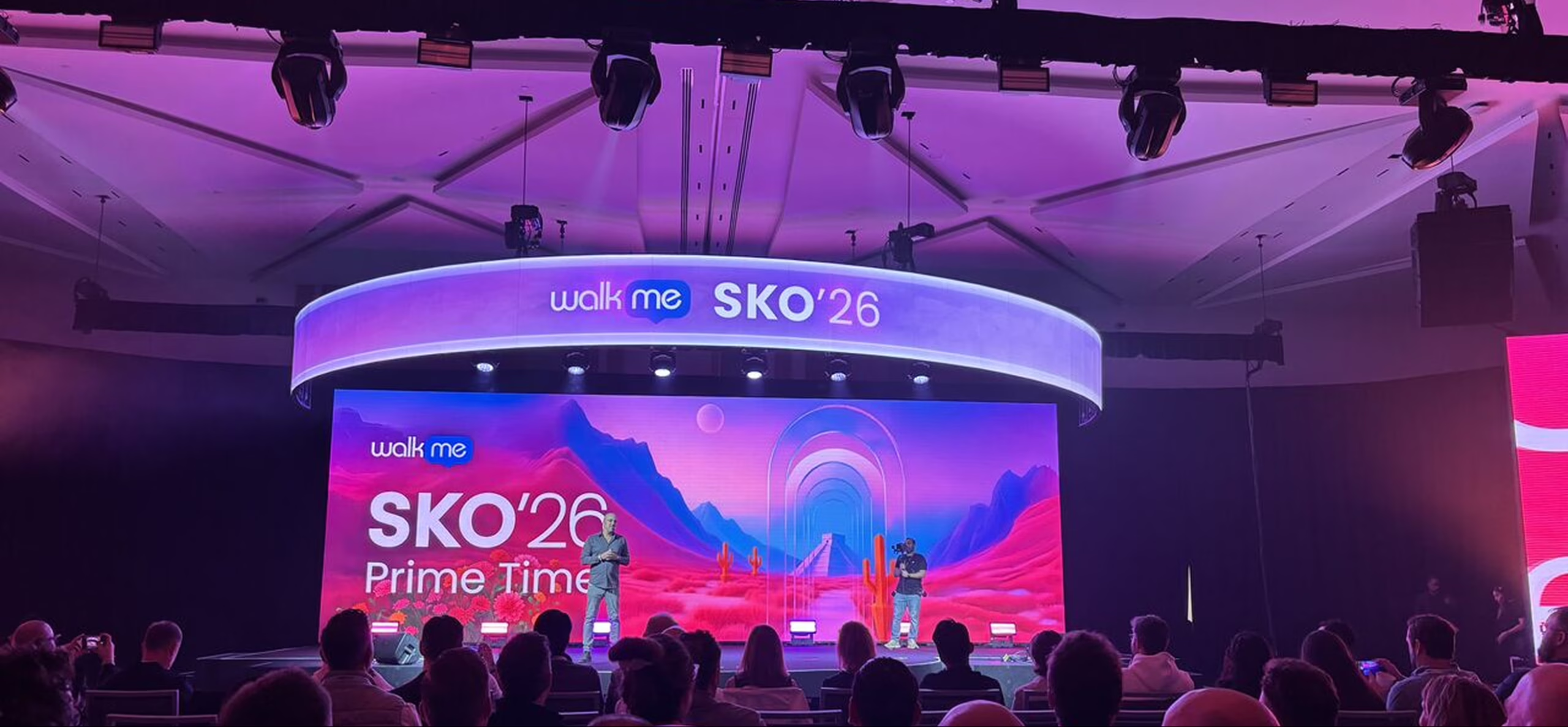
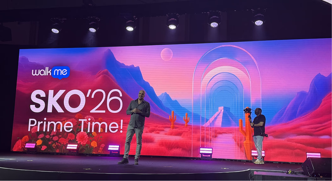
Deployed at Scale
Rolled out across every touchpoint of the 4-day Tulum experience: stage design, signage, welcome kits, room dressings, slide decks, and pre-event campaigns. Reached 400+ global attendees from 10+ countries.

Cohesive Execution
The visual language held consistently across physical, digital, and on-site formats, from email teasers and the landing page to the main stage backdrop.
Reflection
This project was less about producing assets and more about defining direction. With a vague brief and a high-stakes moment, the work was to remove ambiguity, align stakeholders around a single interpretation of “Prime Time,” and build a system others could extend without losing coherence.
The outcome is a visual language that doesn’t just support an event. It defines how the company shows up at a key moment of transformation.