VESTTOO · UX/UI · WEBSITE RESTRUCTURE
COMPANY
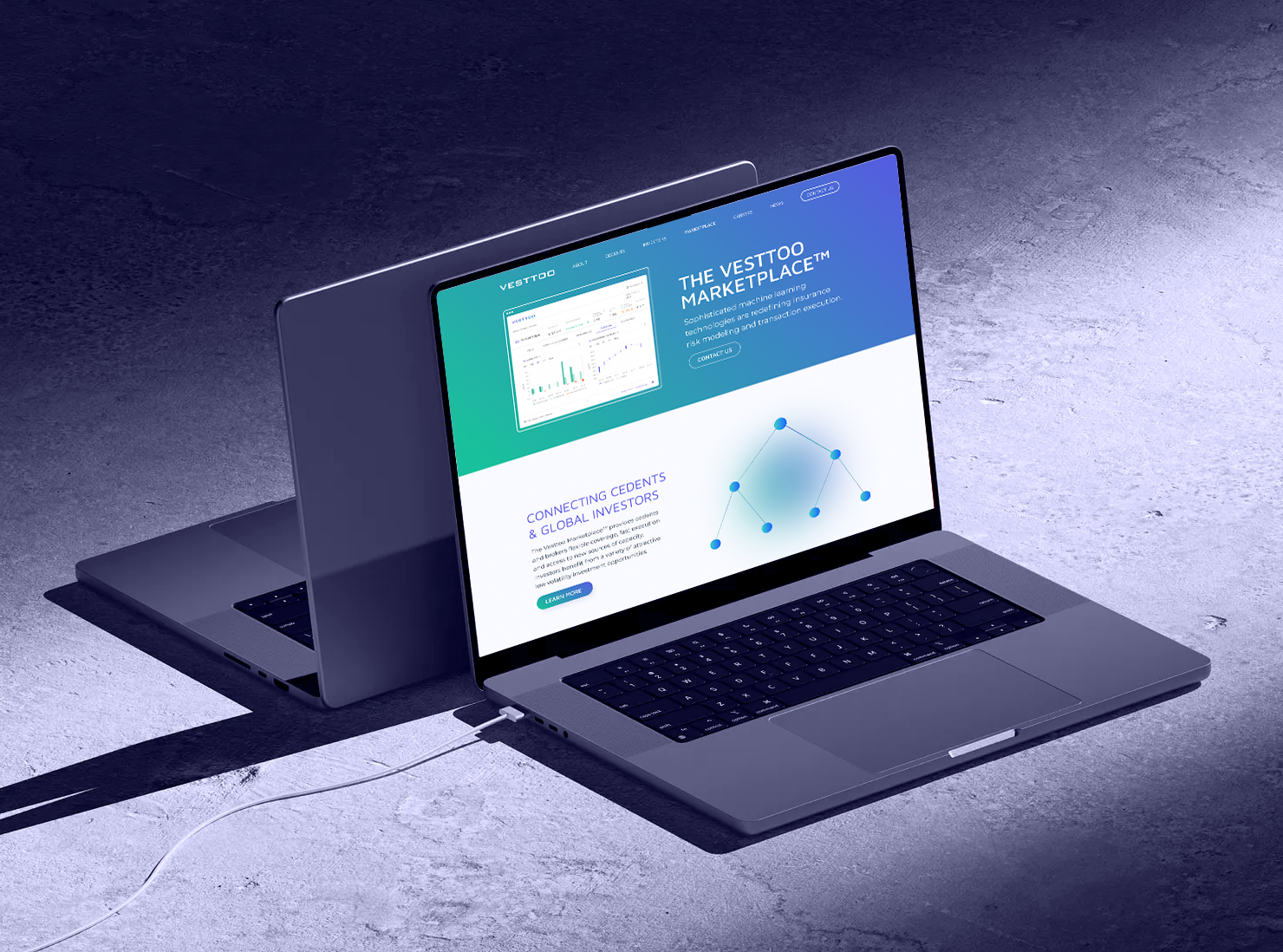
Vesttoo
YEAR
2023
ROLE
Lead Brand Designer
TOOLS
Figma
Full website restructure, sharper UX/UI, 40% more user engagement.

THE COMPANY
Vesttoo is an insurtech startup. It uses AI and data science to rethink how insurance risk gets assessed and transferred. The platform connects insurance companies, capital markets, and investors through new ways of modeling risk.
THE CONTEXT
As Vesttoo grew, the website stopped keeping up. The messaging was unclear, so conversion suffered. The brand no longer matched the company behind it.
And a fragmented experience pushed people away before they found what mattered.
THE BRIEF
The restructure of the website had to:
• Sharpen the value proposition.
• Bring the brand in line with who Vesttoo had become.
• Smooth the user journey to cut friction.
• Build a scalable website on a CMS, so the team can make small changes without a developer.
• Have a website we can track so move away from the slide by slide template.
Sitemap, Navigation and Wireframes
The work started with research, heatmaps, and close collaboration with the brand and content manager.
Led the structure of every page: what information went where, and why. The result was a clear content hierarchy and a more intuitive path across the site, mapped out in a new sitemap, navigation, and wireframes.


Styleguide UI Kit
I created a comprehensive style document with reusable components ranging from core elements to complex layouts to ensure visual consistency, brand alignment, and efficient collaboration with developers across the website.

I then collaborated with an external motion designer for micro-animations and led QA with developers to ensure responsiveness and design quality.