Client: Laflore Paris
Laflore Paris is a sustainable fashion e-commerce brand that blends elegance with eco-consciousness. It offers versatile, handcrafted accessories made from premium cork leather. With a focus on ethical production, Laflore Paris creates stylish, functional bags that seamlessly transition from backpacks to handbags. It embodies a commitment to reducing environmental impact while maintaining a timeless Parisian aesthetic.
Year: 2024
Project: E-shop Menu Redesign
Challenges & Insights:
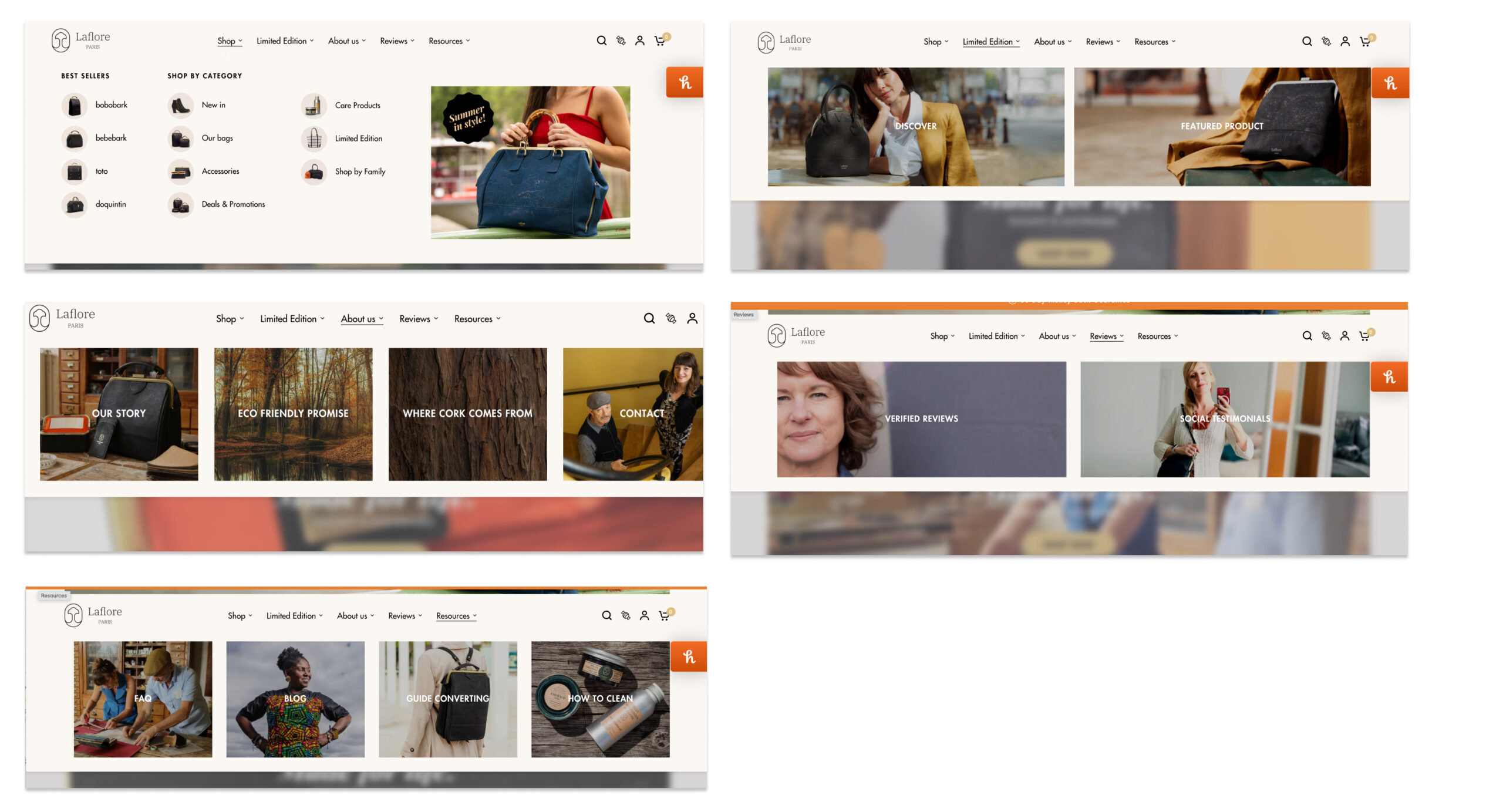
The existing mega menu on Laflore Paris’s website faced usability issues, affecting the shopping experience:
- Overwhelming Complexity: Too many options cluttered the menu, making it hard for users to find what they needed. Nothing stood out, causing visitors to feel lost.
- Confusing Categorization: Product labels and categories were unclear, leading to frustration and abandonment.
- Lack of Visual Structure: Without distinct headings or organization, scanning the menu was difficult, especially on mobile devices.
“We observed that customers frequently reached out to the chat bot with questions about finding products, indicating a lack of clarity in the menu structure.”
Previous mega menu for reference

Objectives
To redesign the e-shop menu, I aimed to:
- Simplify Navigation: Create a cleaner, more intuitive structure.
- Minimize Confusion: Improve categorization for quick access to key products.
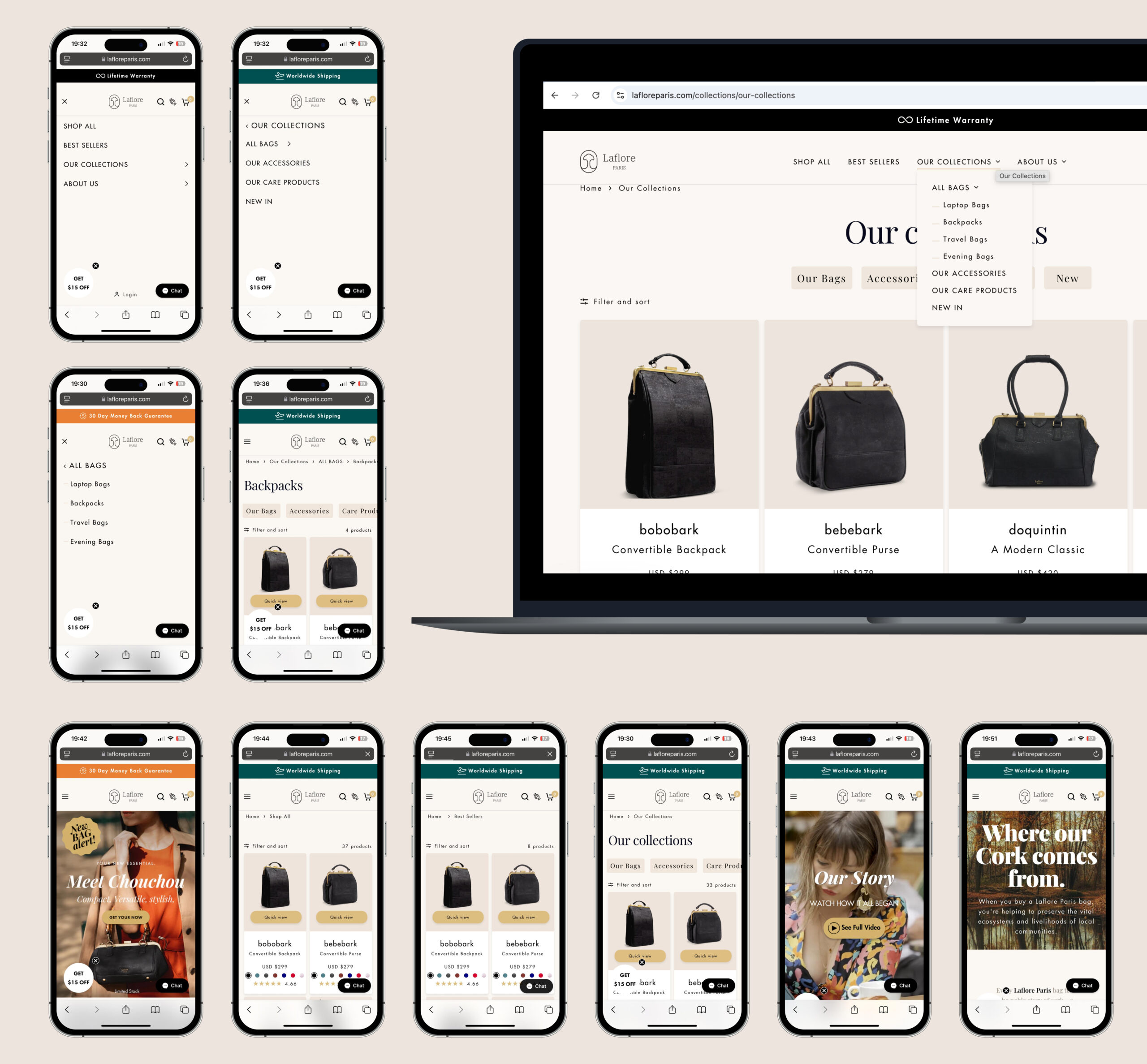
- Enhance Usability Across Devices: Ensure the menu worked seamlessly on desktop and mobile.
My Process:
Research & Discovery
- Conducted competitor analysis to identify industry standards for menu design.
- Performed user testing to understand navigation pain points and gather feedback.
- Studied best practices in UX for e-commerce to ensure a user-friendly approach.
Wireframing & Prototyping
- Developed multiple wireframes exploring different menu structures on Figma.
- Focused on highlighting popular categories, optimizing visual hierarchy, and enhancing mobile responsiveness.
- Presented options to the Product-Marketing team to align the design with business goals, discussing which sections to emphasize.
- Briefed the developer on the different states and answered his questions.

Design Iterations
- Tested prototypes with users to identify improvements.
- Adjusted category placement, visual elements, and menu interactions based on feedback.
- Simplified even more the menus to get to the essential sections (removing specific collections, and specific deals) that were less relevant to the target audience.

LaFloreParis.com
Solution & Outcome:
- Simplified Menu Structure: The new design provided a more organized layout with clear categories and subcategories, improving user flow and reducing menu depth by 30%.
- Enhanced Mobile Experience: Responsiveness was optimized, resulting in a 25% increase in mobile user engagement.
- Increased Engagement: Achieved a 20% boost in user interaction with the menu and a 15% reduction in bounce rates.
- Reduced Customer Support Queries: Chat bot questions about finding products decreased by 40%, indicating improved self-navigation and clarity.
Key Takeaways & Reflection
Mobile-First Approach
Ensuring mobile compatibility from the start was crucial, given that a significant portion of users accessed the website via mobile. Prioritizing touch-friendly interactions improved overall usability.

